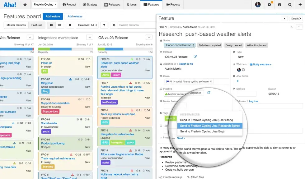
Visual Systems or tools that are referred to as Agile Management Software are de facto with Agile teams. There was a time when whiteboards and stickies used to be synonymous with Agile. I used to be a big fan of physical whiteboards or any space that radiates information. Nothing brings the team together like the way physical whiteboards do. The kind of energy and sense of collaboration that I have seen with these whiteboards can be compared to none of the virtual tools. Thanks to Covid-19, we do not have a choice but to use these virtual systems. Even during the pre-covid days, the advent of geographically distributed teams and work-from-home, made visual systems an absolute need.
Visual Management is a way of making decisions on the basis of what is seen. It has become part and parcel of our life in general. Transport systems use them very effectively. Be it the “Red-Amber-Green” signs that have become quite universal in their usage or those little signs along the way that helps the driver to make several decisions till they reach their destination. Not to forget, the visual representation of the Uber cabs near your pick-up point. They are embedded in our day-to-day living without recognizing that they are visual systems.
However, when it comes to work, we do not put enough efforts to make our work visual. Especially, when we are working as a team, it becomes extremely important to know what each of us are doing and to understand how our work is dependant and progressing. Visual management does more than just indicating the progress of the team. In most places, I have observed that it helps the team in bringing the sense of working on something larger than the individual tasks. It helps in quick decision making and provides different options that could be tried to reach the goals faster and in an effective way. Now, with the teams being virtual and distributed, it becomes imperative to design key interactions with the Visual System to help the teams navigate the complexities and make the collaboration easier and effective.
Some of the tools that are available in the market includes Atlassian JIRA, CollabNet VersionOne, Microsoft TFS etc. Regardless of the tools that are used, following are some of the key operating principles of interacting with virtual visual systems:
- Team owns the system: The team needs to be involved in designing the visual system. The ideas need to come from them so that the discipline and authenticity of updates are owned by each individual. The visual system would not do anything by itself. The team and its quality of interaction with it decides the success and effectiveness of the system.
- Everything that the team does is in the system; Team does only what is there in the system
- Discipline is the key aspect of ensuring that the Visual Systems are used well. This is perhaps the first most important commitment that needs to take.
- It is important that the teams just do not use the system that is designed by someone else. They need to take an active part in providing the necessary feedback about the system.
- Start simple and evolve the system: Just as in software development, it is important to not get fixated with the idea of getting things perfect before starting. Vertical slicing adds tremendous value here as well. And with every sprint the Visual system can also evolve just like the product you are developing. Listed below are the basic elements and decisions that you need to make while you start using the visual system –
- Decide on the appropriate framework – Scrum/Kanban/YourOwn
- Board with a Basic flow of 3 columns
- Prioritized and groomed Backlog at least for 2 to 3 weeks
- The work item types and the hierarchy
- Clarity on how and when the items pass from one state to the other – DoR and DoD
- Basic Visual radiators like Capacity trackers and Burndown charts
- Design for maximizing Flow and minimizing Constraints: As you evolve the system, you need to move beyond the 3 columns and understand where the items change hands (Hand-offs). Capturing them as is and elaborating the board into multiple columns would help the team to understand where exactly the work item is stuck. Some of the other elements that needs to be kept in mind are:
- Make it more story/item focused and less people focused. It is more important to follow the story than to follow the people and their capacity. Our main job is not to keep people busy to finish work items.
- Start from the end of value stream. Talk about “Done”. There is no feeling like the story accomplished. So, when the story gets “Done”, allow people to be proud of the same. It is important learn from the success as much as we learn from the failures.
- Use the system to bring out the problems. The success of visual system is its ability to surface problems and risks. Use mechanisms to highlight blockers and WIP Aging.
- Limit WIP. This would have the most profound impact on the flow of Stories.
- Eliminate reports by designing visual dashboards: Visual dashboards are an important part of providing early and continuous feedback to the team. This is where the web tools score a big point over physical whiteboards. Take care of the following important points.
- Design the KPIs around the problem areas and objectives. Contextualize the same. It cannot be the same for all the teams.
- Let the numbers and outcomes be the point of conversation and not the point of conclusion
- Queries (For eg: JQL) make these tools really flexible in terms of reporting. Make use of the same.
- Let the Leader walk in (virtual) to the ceremonies instead of driving them. Let him/her ask questions and be asked questions. Let the leadership be the figure who helps the team solve the problems and remove impediments that are lined up on the board. When the leader contributes to the system, it would have a tremendous impact on the members. This is what would really lead to a cultural change. In lean, we call this as Gemba, which eliminates the need to report.
- Design for simplicity: No system would succeed if it becomes difficult to use the same. The same goes with Visual Systems. Let it not be a piece of art. There is no need to have beautiful looking boards if they are not useful.
- Always ensure that when a particular section is zoomed in, it conveys the information pretty soon.
- Make the system easy to recognize problems, understand the countermeasures and have an idea of when they are going to be solved. This whole thing should not take more than a minute.
- Avoid using multiple colors and too much information.
- Continuously refactor the system to ensure that the system remains decluttered and simple to use.
Visual systems act as more than a management tool. The way teams interact with this system helps us to understand how Agile the teams are. The teams’ interaction with the system provides enough clues about the internal team dynamics as well. As an Agile Coach, I use it to plan my interventions and enable the teams to reach their high-performance goals. The power of these visual systems is yet to be explored and realized by many teams. They have a gold mine of information which could be used for enhancing the quality of the product or could be used during retrospectives for continuous improvement. Just be aware that you do not discount the emotional aspects of working with the teams, while you fully utilize the data. Remember that we are working with people and not with machines. Using visual systems effectively accelerates the team’s Agile journey. I hope the teams start using this system as a mirror and reach greater heights in team-performance.


